
Dashboard
- Keren Trosler

- Apr 1, 2007
- 4 min read
Updated: Mar 10, 2025

The term "dashboard" has become common for anyone involved in information presentation. But do we really know what it means?
The term has at least two meanings related to the computing world - the first refers to the visual design and interface through which users experience the chosen knowledge management solution (as a reminder, the first portal interface of SharePoint was called Dashboard six years ago, and only later were Tahoma and SharePoint born). The second interpretation relates to graphical indicators that display processed and up-to-date organizational data. So, when people say "Dashboard" in the context of knowledge management, what do they mean?
Most often, they refer to an indicator that visually and sophisticatedly presents essential organizational information at a glance, with the ability to examine the data in greater depth. The Dashboard makes current information accessible to employees and managers. For many years, these solutions were part of Business Intelligence (BI) packages, but only when the portal became a popular tool did the subject gain momentum, and today it is a central tool enabling effective management based on indicators for exceptional events.
For example, a dashboard might allow users to view the progress of a central project daily, a display that keeps all company employees "in the picture" and focused on objectives. In this way, everyone is informed about the project status, transparency increases, and with it, satisfaction.
Beyond Visual Appeal: Key Dashboard Capabilities
Beyond being visual and colorful, dashboards have two central capabilities that make them attractive to users - focus and customization:
Drill-Down: The ability to display expanded information about the underlying data. Users can reveal formula results, calculation methods, and more. This depends on the level of detail the system administrator wants to expose to users and the added value of the information.
Customization: [Note: There appears to be missing text in the original about customization capabilities, but the conclusion mentions that these features help companies adopt information systems suitable for their needs.]
As stated, these characteristics increase the system's attractiveness to users, who see it as a tool to assist with their work.
Advantages of Data Presentation via Dashboards
Quick and straightforward ability to focus on issues requiring attention, by separating them from all other organizational information and highlighting them through indicators.
Capability to present processed information from different systems, providing added value beyond the source systems. This allows data integration and centralizes all information in one place (resulting from indicators linked to integrative data warehouses).
Attractive graphics that encourage users to examine the displayed information more carefully.
Dynamic data that updates automatically, without requiring manual updates.
Despite the advantages mentioned, it's important to remember that the visual and graphical capabilities, as well as the successful long-term implementation of the system, depend on the accuracy of the data, its quality, and flexibility of updates. Additionally, to ensure maximum user-friendliness and simplicity of use, the interpretation of the display must be understandable and intuitive. It's advisable to avoid an excess of indicators to prevent overwhelming the user—in other words, "grasp all, lose all."
Just as a good knowledge management solution is tailored to the organization's needs, so should an effective indicator. It should reflect the organization's core activities in a way that demonstrates added value over the current state, be understandable at a glance, and provide deeper information as needed. The manner of presentation depends on the type of information being displayed, the organizational need, and, of course, the creativity of those involved. To adapt the display to the information presented, it is necessary to be familiar with the available options. Below are some standard presentation methods:
Traffic Light: Just like on the road, red indicates a problematic situation, yellow a neutral state, and green signifies an excellent condition.
Faces: A sad face indicates failure to meet criteria, while a happy face signifies a satisfactory state.
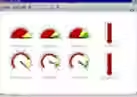
Dashboard: Just as a car's dashboard displays performance, so does the organizational dashboard.
Behind every display, a calculation formula must be defined, as well as how the results of the formula influence the display. For example, if displaying the implementation of decisions over a period, one could calculate the percentage of decisions that have not yet been implemented and divide them by the total choices for that period. At the same time, it is necessary to define how the result (implementation of decisions) reflects the indicator—for example, 0-40% of tasks not yet closed would mean a green traffic light, 41-80% of tasks not yet closed would mean a yellow traffic light, and over 81% not closed would display a red traffic light (or a frowning face, or any other appropriate display).
To summarize, over the past two years, many organizations have adopted organizational performance indicators quietly and without drawing much attention. These dashboards enable most users to locate and analyze the information they need for their routine work. Presenting data in this way makes business information accessible quickly, intuitively, and simply. We recommend using these indicators to provide added value to users through visually appealing displays. Still, we reiterate that to achieve the desired outcome, the presentation must be clear and based on reliable and accurate data.


Comments